"Towards Kenbane"

"Towards Kenbane"
Spectacular Irish coastline on a stormy day

Saturday, 18 July 2015

2015 Summer Exhibition with the Ulster Society of Women Artists USWA

This is well worth a visit so, come along and join us if you can... 


Exhibition Opening Saturday July 25th, 2pm to 4pm
runs all week from Monday July 27th through to Saturday August 1st

Friday, 3 July 2015

Summer Arrives!

I have been terrible as far as posting is concerned - there are always so many other things needing done and, when you have Fibromyalgia, COPD and Osteoarthritis, time management is a major issue..... sorry all!

We have all been moaning about the cold, wet and stormy weather over Spring, yet, now that we are in the middle of a summer mini-heatwave, everyone groans about "how hot and humid it is"!  I guess we are not accustomed to higher temperatures over here and, who knows, this may be all the summer we get this year.  At least the sun is shining!


People here in Northern Ireland are really obsessed with all things weather-related.  It's quite amusing - everyone watches the forecast [knowing that it's probably wrong] but it gives us all something to talk about.

Bruno loves to come with me in the car and, like all clever dogs, constantly monitors for the tell tale sounds and movements that signal a potential trip [funny how they always seem to know when you're headed to the 'v-e-t' isn't it].  
Anyhow, last Monday, he was at the door before me.  It was a warm sunny  day but I figured he would be okay, parked in the shade with all the car windows open [and I always have doggie-water on board].  He dutifully kept the driver's seat 'safe' for me and patiently waited outside the shop.  
Even though I was literally five minutes, his tongue was nearly two feet long by the time I got back.  With his tail whirling round [in typical Labrador fashion], he greedily slurped up the water I offered and gave me his "ok let's go home now" look.


It got me thinking about heat exhaustion and just how little we realise how easily it can affect not only ourselves, but our pets too.  It doesn't have to be a sweltering hot day to be overcome - most of us do not drink nearly enough water at the best of times and, certainly not enough on warmer days too.  Just two days ago, while I was in the supermarket, I walked around the fruit and veg aisle to see a lady 'out cold' on the floor!  The ambulance arrived quickly and the store staff had already brought out a chair and a bottle of water.  The poor lady was suffering from heat exhaustion and had overheated to the point she fainted.... so, what treatment did the paramedics offer?  Simple..... more water!  

Mugsie [left] sneaks a lie in
On a different subject, we have a visitor to the garden every day - a lovely little feral black cat.  I love all animals, so, imagine the horror when we saw said cat make off with a baby rabbit in it's mouth!  On the opposite side of 'nature versus pampered'.... the photo on the left was taken by my hubby - it shows our [late] puss 'Mugsie' snuggled up behind me in bed [UNDER the duvet!!].... no foraging for food for him.  Such are the laws of nature.


It's more widely known now that I also paint under the name 'Michelle Carlin'. It is this work [all to commission] which keeps me so busy and out of mischief ... to the point that I haven't had a chance to get busy with the watercolour paints for quite a while!  With two exhibitions looming on the horizon, I really MUST allocate the time to sit down and start - there are a few spectacular photo reference images I took around our coastline that I am itching to work on and, will share with you on here...... in the meantime, here are a couple of Michelle Carlin paintings [acrylic on canvas and canvas board].....

Sunny Day on the Beach by Michelle Carlin


Red Balloon by Michelle Carlin


Thursday, 5 March 2015

Mika, Bruno & "The Auld Lammas Fair"


"Mika" in her favourite Winter position

on the sofa in front of the fire!


"Bruno" looking serious 

[for a change]

I thought it was high time to introduce our two furry friends - Mika, an 8 year old German Shepherd and, Bruno, our 2 year old 'singing' [totally nutty] Chocolate Labrador. 


I have been really quite busy over the winter and, health hasn't been great.  However, I did manage to finally finish "THE AULD LAMMAS FAIR", an oil on canvas 24" x 36".
It is a private commission and, I'm told, will be hanging in 'pride of place' in it's new home.  
This is an important painting, not only because a few of the key characters portrayed, have since passed away.  Moreover, the famous 'Market Day' depicted [always the second day of the Fair], as well as some of the old buildings, are no longer in existence.
Thanks to the McAuley family for permitting me to share this image ...


Wednesday, 18 September 2013

AND NOW FOR SOMETHING A LITTLE DIFFERENT!

A PASTEL SEASCAPE

Even though I haven't shared anything from this painting so far, I decided to post this image to show the pastel SEASCAPE which was completed yesterday:


Using mainly 'Unison' Soft Pastels and a reference photo [taken from my 'seascape library' - hundreds of digital pics taken around the local coastal area], this painting was done on an 8" x 24" canvas board.  

To prepare the board, three layers of white Acrylic Gesso were roughly scrubbed in [NOT sanding between] leaving each to dry completely. You do not have to use white - many people prefer to work on a coloured ground.

The first step is to layer in the darks:  
I chose a selection of three shades [tones] of blue, from dark grey/blue through to a light Cobalt, and the same with the greens.  

Tip:  Leave the lightest areas blank.

Select ALL the colours you intend to use and lay them out separately - this means you will not confuse them from the rest and it makes the painting process much easier.
It is important to select darks and lights of the same colour as opposed to 'lightening' a darker colour with white [which will only make your colours 'opaque' instead of keeping them 'pure/transparent'].  
There are SO MANY colours and shades/tones available in pastel - it's best to build up your collection slowly, as they are needed, otherwise you could spend a fortune!
I have been 'collecting' for years - this photo shows some of my soft pastels and how I lay them out for ease of visual selection:-


Right, getting back to the tutorial...  this type of scene turns out best if you work up the painting as a whole [rather than finish each section in isolation].  I 'blend' with my little fingers, using a REALLY soft touch [remember to clean off your finger as you go]. 

The lights in this painting are various shades of green, blue, violet, yellow, cream and finally, white.  
Once the light colours have been laid down, I 'blend' them into the dark areas [cleaning my finger on kitchen roll in between each touch] using a light touch.  

To achieve the effect of light shining through the top of the curling wave, I first used a light yellowish-green [along a 'mossy' tone] then working in the darker blue and green mix at the base of the wave, working from the bottom up.  Blend the light into the dark then overlay a pale yellow, working from the top down, blending this as well. 

I tend to work 'instinctively' rather than following any kind of formula - if you learn to look at your chosen image and 'see' the colours [without too much analysis], you will ultimately also paint 'instinctively'.
As you lay in lights and darks, adjust the work as you go... this might be simply shifting a line ever so slightly or making the foam 'holes' smaller/larger.  With each adjustment, look carefully at the painting as a whole to ensure your changes 'fit' the overall realism and don't look out of place or unbalanced.

The last marks are made with the lightest colours - these are the 'icing on the cake' and are, as such, NOT blended in.  This way they add the sparkle!

The following images are close-up's from the painting which hopefully, will help show the process a bit clearer:


I hope you have enjoyed this short tutorial?

Since I have quite a number of commissions to work through, it will be a little while till I can post another tutorial.  
Hope you will join me again and, in the meantime, HAPPY PAINTING!!!

BALLINTOY SEASCAPE - Finished Watercolour

So, here is the finished painting: 


I've added several more glazes overall, softened even more sky and wave edges and, finally, darkened the foreground even more to add further depth.

The finishing touches were to highlight the 'focal point' on the rocks with a soft wash of W&N "Burnt Sienna".

Here is another image, a close up, indicating some of the brush work:


Hope you have enjoyed following along with the painting process!
Happy painting!


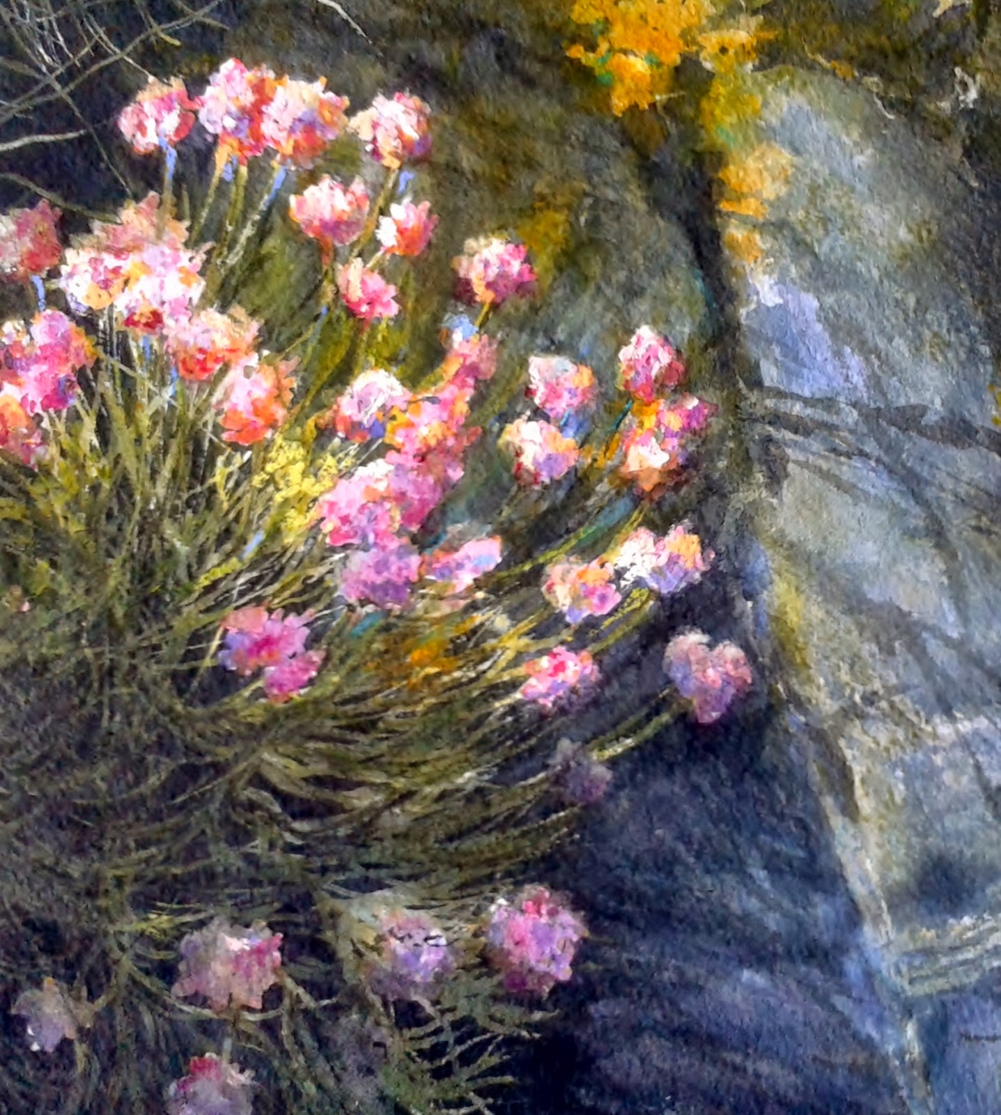
"Sea Pinks" Final Phase

Well, I finally finished the watercolour painting of the "Sea Pinks" and.... I must have added at least 8 glazes to get the depth I felt it needed. There was considerable waiting and "watching paint dry" [which I'm not really good at] and, 

I have to admit, these are horrible photographs which makes it looks quite 'dull', but here it is...


As you will notice, I have 'cropped' the painting - it was just too 'heavy' on one side with all the flower detail and 'empty' on the other.  

I took all the paintings this morning to have them framed and will reserve 'final judgement' on this one until then as I'm not particularly happy with it.


Saturday, 14 September 2013

"SEA PINKS" - Stage III

"SEA PINKS" - Stage III


 I have not had much chance to work on this watercolour, although a further glaze of warm and cool greys has been added.  
This starts to indicate rock texture on the right hand side.  The initial shadows, cast by the Sea Pinks, have also been washed in.

The 'masking' is still in place and will not be removed until further darks and rock texture have been glazed on [if the 'masking' was removed at this stage, further glazing would be extremely difficult and fussy].

I am planning to work on this painting tomorrow and will post further images to show it's progress...

AN ADVENTURE WITH THE DOGS!

Our Trip to Scotland

We have had a really great visit to Northern Scotland since my last post and, obviously, I haven't been painting for a few weeks... 

We went across for a mini-break but mainly to return our son and daughter-in-law's two dogs after a three month dog-sitting experience.  "Cody" [an adorable bouncy black Labrador] and "Rico" [a VERY large, gentle, sweet-natured black German Shepherd who we nicknamed 'Yogi Bear'] were the perfect house 'guests' and we found ourselves really sad to have to take them back home....

So, there we were, in the car with FOUR large, excited and rather talkative dogs [me, wedged into the passenger seat, practically having to sit on our luggage and our sandwiches and coffee flasks tightly packed around my knees].  As we headed towards the ferry, we hoped they wouldn't eat each other [or the car] during the 2 hour crossing!  

The car windows were constantly steamed up from our panting pooches and, initially at least, I was poised with the towel hovering beneath "Bruno's" chin - he has always had the tendency to be car-sick and, even though he was fairly 'dribbling' by the time we arrived at the ferry terminal, he wasn't actually ill [thank goodness]!  

We assume they were well-behaved below deck since there were still four [intact] dogs, no ears had been shredded, no holes chewed in seats and all seat belts appeared fully functioning.  

Let's just say, it was quite an eventful journey - taking two dogs [EACH] on their leads, to 'stretch legs' and have 'toilet breaks' along the way, is hilarious.... especially when they each head off in different directions at the same time!  Of course no one wanted any drinking water [until we were back on the road that is!]. Oh what fun we had during that 16 hour trip!

Before I start talking about the next stages in this watercolour painting, I thought I'd share a picture of my two studio companions "Mika" [our beautiful German Shepherd girl] and "Bruno" [our chocolate Labrador, now 9mths old - yes, he IS a big boy!].  

 They can be either VERY good [when they're both sleeping at my feet] OR, a real pain in the rear [when they decide it's play time] - I have had to stop several times to remove acrylic paint from various ears and noses!

... and, finally, here is a pic of "Rico" and "Cody" in the back of the car during their trip back home to Scotland:


BALLINTOY SEASCAPE

WATERCOLOUR Stages III and IV

OK, back to watercolour..... and, as you can see, I have been working on the Seascape painting 'as a whole'.  By not focusing on [and completing] one area at a time, I can ensure that the painting remains 'balanced' as it progresses.
Quite often though, and especially with still lifes and floral subjects, I do actually work each area up to completion but find that the 'overall' approach works best with seascape and landscape subjects.

I am still using Daniel Smith 'Indigo' and 'Quin.Burnt Sienna', W&N 'Sap Green', 'Winsor Blue' [green shade] and a tiny touch of 'Permanent Rose' and 'Burnt Umber' to warm up or cool off the grey tones.

As I paint, I am constantly thinking about 'directional light' and 'cast shadow' areas. This is important in order to maintain realistic tonal values and to ensure that I don't overwork the painting as a whole and, ultimately, confuse the eye of the viewer.

Today I managed to sit for quite a while [with several 'breaks' in between] and have nearly finished this piece, as shown in the next picture [which, unfortunately, was taken when the daylight had already started to fade]:


I have added drama by adding strong darks to the foreground and, by directional brush strokes, have added movement to the water.  
A glaze of cool grey has been washed over the background sea which 'pushes' that area back, leaving the foreground better focused. I can't really give you a 'recipe' of the colour used because it was just a mix of what was left on my palette!

Hard edges have also been softened here and there [clouds and main foam areas], again, to keep the most detail within the focal point.  

Tomorrow I will finally darken and add some detail to the cliffs on the left and to really 'pin down' the focal point, I will add a little warmth with a very soft glaze of "Burnt Sienna" on the lightest edges of the main rocks.

Once complete, I will post a picture of the finished piece, taken in better light.

Sunday, 11 August 2013

NEW WATERCOLOURS - PART II

"EBB and FLOW" - part II

Due to 'dogs', 'shopping' and just plain 'sitting', I didn't get round to painting yesterday BUT, today is another day...

Further layers and glazes have been laid down in the sea area, using watery mixes of Phthalo Blue and Sap Green.  You will notice that the brush marks are made in the direction of the water - this starts to give the painting the 'movement' that is so important.

This picture starts to show more detail as the layers are built up and will be easier to see as the work progresses:


I also softened some edges with a 'thirsty' brush as well as damp cotton wool [pop the cotton wool into clean water and make sure as much water as possible is squeezed out, otherwise you risk a 'bloom'].  The sea area in the middle has also been underpainted with a watery Verditer Blue and Phthalo Blue mix.

The composition still looks somewhat unbalanced but, as the other rocks below the surface start to appear, things will balance out to ultimately 'frame' the focal point.

The first glaze has also been added on top of the under painting, over some of the rocks.  I used a slightly stronger mix of Indigo and Sap Green and, while the paint was still wet, I dropped in some Burnt Umber mixed with Permanent Rose.  Once the 'shine' left the surface [look at it against the light], I scraped into the paint with a palette knife to start indicating the 'form' of the rocks.  If you do this too soon, the paint will simply creep back.

I have included the next two close up pictures to show the brush strokes in a little more detail.  You can also see the areas which were softened with the damp cotton wool...


TIP:  Damp cotton wool is the best 'tool' to soften edges.  If you do happen to end up with a 'bloom' [like the small one on the rock in the pic above], simply wait for it to dry completely, then soften the hard edges again... ta-da!

"SEA PINKS" - part II:

The rock surface has been glazed again with Indigo, keeping 'rock shapes' in mind.  Again, while the paint was still wet, I dropped in some stronger mixes of Yellow Ochre and Winsor Yellow to indicate where the lichen is growing.  I can see that some of these lichens are a creamy/white colour, so, rather than try and mask them out, I used [and will use again] a 'dry brush' technique.  That way when I lay in subsequent glazes, I can save some of these textured areas.


By the way, I forgot to mention that the paper I am using is 300lb Saunders Waterford NOT.  Paper is a personal choice and very much depends upon your painting style preferences - this is my 'paper of choice' [sometimes I use ROUGH] plus, I hate fiddling around stretching paper.

My brand choices of watercolour paint are Winsor & Newton, Daniel Smith, Sennelier and, occasionally, M.Graham & Co.;  all are artists' quality.


Friday, 9 August 2013

NEW PAINTINGS - STAGE ONE

I have finally put brush to paper and started not one but two new watercolours. So, while the paint is drying, I decided it would be a good time to update the Blog and start sharing the painting process.


 PAINTING I "Ebb and Flow"


 This first painting is a SEASCAPE and this is the reference photo I am working with.


You will notice that the painting isn't exactly like the photo - this is because, since I know this area of the coastline so well, I can carry a lot in my head. I have also used some of that magic 'artistic license' to pick out and move around parts of the scene!

 This second pic shows Stage One of the painting process and goes some way to explain how I go about it.


I used a 2B pencil to lightly draw out a few of the key shapes [use a light touch so you do not mark the paper] and then applied a pale 'undercoat'. This was a very watery mixture of Verditer Blue for the sky, then adding Phthalo Blue and Indigo to this, I used a 'hit and miss' technique over the shadow areas of the water. As you will see [or not!], the wash has dried so pale that it is almost impossible to see in the pic!  This is because it is only the first of many glazes which will be added as the painting progresses and will actually work as one of the varied subtle colours of the deeper water and the foam.... keep watching and you will see what I mean!

The rocks were laid down with a watery Yellow Ochre. The reason I chose this as the underpainting is because there is an 'ochrey' tone shining through some of the rocks in this area.  Again, local knowledge and keen observation are key.  I haven't used any masking fluid by the way, although you can if you find that easier.

 PAINTING II "Sea Pinks"


 This second painting is taken from the same area and is of our pretty native flowers, 'Sea Pinks', which bloom during the early summer. The flowers are set against the beautiful grey blue local rocks and are interspersed with bright yellow litchens.

 In order to permit free 'washes' without having to fiddle around small areas, I used masking fluid [I personally like Pebeo Drawing Gum, applied with the tip of a plastic palette knife] to preserve the flowers, stems, grasses and a few other light marks on the rocks. The first pale wash is purely very watery Indigo Blue, and, as the 'shine' leaves the wet paint, I can safely drop in a thicker mix of the same colour to start adding depth.

Tip: do NOT shake your masking fluid before using - you will only add 'bubbles' to your painting surface which will ultimately burst, leaving a weird round masked mark once it's removed.


Both paintings have been left to dry completely overnight. Tomorrow I will continue on both and will post progress.

Monday, 29 July 2013

"Discovery Art Workshop" at SeaView Gallery!

At the end of June we had a successful Art Workshop, held over two days in my studio at SeaView Gallery in Ballycastle. I had the pleasure of hosting this event for four wonderful, very talented, lovely ladies. Apart from all the laughter and dry wit, we had fun dabbling and experimenting with a fairly wide range of mediums - hence the Workshop being named "Discovery Art". The whole idea was to give everyone a chance to step outside their normal painting comfort zone and 'discover' what was possible by utilising different styles and mediums.
To the best of my knowledge, my "students" not only enjoyed the two days, but actually learned a few things along the way! Pretty amazing when you take into consideration that three of the ladies are elected members of the "Ulster Society of Women Artists" [uwa] and, all four are accomplished artists!
You know 'that' feeling when something finally works out [or not] the way you want it to!
We started Day One with a fun exercise - spending the morning painting individual interpretations of the proverbial apple, using watercolour. The end results were amazingly different, and entirely a result of four very personal painting styles. It just proves how variable the 'eye of the artist' really is! After lunch the ladies started on a painting of their own chosen subject, each with a different medium and style - we had everything from fine art realism to loose impressionism. I, of course, tried not to bore anyone with the mini demos and 'technical-type talks' in between! Day Two saw a continuation of the ladies' work, interrupted for tea/coffee/lunch and another mini acrylic seascape demo by yours truly. The Workshop ended with four really impressive paintings [not forgetting the 'apple' interpretations as well]. I wanted everyone to pose with their work so I could take a pic for the record... SO....after some pleading, encouragement [and even more hilarity] here are the results. Of course I only told everyone I was going to post their pics online, AFTER I took them!
I so enjoyed these two days and look forward to meet up with the ladies in the near future!

Sunday, 3 February 2013

PUPPIES and PAINTINGS

Well, it's been REALLY far too long since my last post and I've probably lost you [wonderful followers] as a result.  However, since I will be posting regularly from now on, I am hoping that some of you will drop by again?

It's not been particularly hectic [in the studio] since the start of the new year, but rather, it's been slow and steady as I completed several commissions.  This is why I haven't been posting...

In approximately two or three weeks, we'll be adding a new ball of fur to our family.... his name is "Bruno Bournville" [just Bruno for short] - he is the puppy at the top right in the photo above....isn't he just so cute?  Bruno and his four sisters and one brother are about 8 weeks old in this photo.  They are growing so quickly now and even a few days brings big changes.

Bruno is a chocolate labrador, the same as his Mummy and Daddy.  Every time I've been to visit, he has snuggled up under my chin and gone to sleep!  Can you imagine how utterly adorable it is to have a warm puppy curl up on your shoulder [I just wonder if he will want to do the same when he's fully grown - yikes]?!

Mika, our German Shepherd, will be over the moon when Bruno comes home - another little soul for her to follow around, play with and 'mother'.... poor pup will constantly have soggy ears because Mika is a very 'licky' dog!  On the other hand, Mugsie our Havana cat, will probably NOT be so happy to see Bruno - at nearly 17 years old I guess he's allowed to be grumpy - I anticipate he will retreat to the safety of upstairs for a while.  After our beloved black labrador, Cody, died of cancer seven years ago, Mugsie was really depressed - he wouldn't come downstairs.  It was a stand-off between us but eventually I had to take his food/water/cat litter up, and, because he wasn't exercising at all, he got SO fat that he looked like a sausage with four toothpicks stuck in it!

I am looking forward to have to work around TWO furry bodies at my feet in the studio instead of just one - how wonderful it's going to be! 

Please do come back to join me to find out how [and WHAT] Bruno, Mika and Mugsie are doing..........
Posted by Picasa

Wednesday, 24 October 2012

NEW WORK

Good morning!

I am about to start a new painting, simply entitled "SEASCAPE".
At each relevant stage I'll take a photo and, upon completion, will post  the FREE DEMO here. 

Hopefully it will be helpful for other artists who want to either start or perhaps improve their seascapes.

so WATCH THIS SPACE!
Happy painting everyone........................................

NEW TUITION SCHEDULE for 2012 - 2013

Just announcing the new 2012 - 2013 schedule 
 WATERCOLOUR CLASSES, WORKSHOPS & DEMOs:

TUTOR: Edith McClelland aea uswa wcsi

all enquiries/bookings through website please
<www.emcclellandart.com>


"WATERCOLOUR YOUR WAY"
at SeaView Gallery Studio 
[maximum 4 students per class]
Two classes each Tuesday [2 sessions per day]  
11.00am-1.00pm AND 3.00pm-5.00pm

Who would be likely to benefit from these classes? 
Beginners, intermediate and even more advanced level students who can expect to receive individual tuition within the group in a relaxed and fun environment. This class will benefit those students who are serious about advancing their art.

What will we do in class?
We will cover all aspects of this exciting medium, including materials, colour theory, tonal values and composition with strong emphasis on developing each student's individual style of painting.

Cost per student:  £56 [for four 2 hour sessions] payable in advance.
Price includes tuition and Class Notes [but not materials which would be extra if required] as well as tea/coffee & biscuits.


"FUN WITH WATERCOLOUR" 
at SeaView Gallery Studio
[maximum 4 students per class]
Ongoing classes each Thursday
2.30pm-4.30pm

Who would be likely to benefit from these classes?
Students who want to go beyond the traditional and be more experimental, pushing  the boundaries of watercolour.

What will we be doing in class?
This fun class will involve splattering, pouring and just otherwise exploring the medium.  We will experiment with different types of salt, cling film, paper towels, block printing, tinfoil and various other everyday objects.

Cost per student:  £56 [for four 2hr. sessions] payable in advance.
Price includes tuition, Class Notes, plus some materials for the first session only and tea/coffee & biscuits.


"ONE DAY WATERCOLOUR WORKSHOP"
at SeaView Gallery Studio
[maximum 4 students per workshop]
Full Day [10.00am-5.00pm] 
scheduled upon request

What will we be doing in this workshop?
Introductions over morning tea/coffee and biscuits will break the ice, after which there will be an interactive demo of our chosen watercolour subject.  Students will then work on a painting of their own choice.  There will be a lot of personal tuition in this relaxed fun workshop.

What can I expect to achieve in this workshop?
Students will benefit from the intensive study of their chosen subject and near one-on-one tuition.  There is great pleasure in working together in such an interactive exercise and the exchange of ideas will be beneficial. Students can expect to learn as they have fun.

Cost per student:  £55
Price includes demo, tuition, a light buffet lunch, tea/coffee & biscuits.  Students will bring their own materials [a list will be provided at time of booking].


"ONE DAY ART WORKSHOP"
at SeaView Gallery Studio
[maximum 4 students per workshop]
Full Day [10.00am-5.00pm]
scheduled upon request

What is this workshop all about?
The main difference in this workshop is that each student will be working with their preferred medium on a subject of their own choice.  Rather than watching a demo, students will spend the full day receiving intensive tuition in their chosen field in a relaxed fun environment.

What can I expect to benefit from this workshop?
As well as the near one-to-one tuition, students can expect to interact with the other participants, picking up a wealth of hints, tips and ideas on each of the mediums in use.

Cost per student:  £55
Price includes tuition, a light buffet lunch, tea/coffee & biscuits.  Students will bring their own materials [a list will be provided at time of booking].


"PAINTING DEMOs" & "ONE DAY WORKSHOPS"
can be arranged for art societies, institutes, schools or other groups
scheduled upon request

Cost  per Group Demo:  £90 per 2 hour session [minimum 2 hours]
plus mileage at £0.40p/mile and other materials will be extra [as agreed].

Cost per One Day Workshop:  £160 per person* - includes tuition, demo, 1 lunch and refreshments.  Materials not included and mileage at £0.40p/mile plus other expenses extra [as agreed].

* dependent upon venue.


"INDIVIDUAL ART TUITION"
at SeaView Gallery Studio
upon request
Tuition tailored to individual requirement

Tuition Cost:  £120* per student - full day tuition [6 hours]
                          £65* per student:  half day tuition [3 hours]

*Includes tuition, class notes, materials, light buffet lunch [for full day tuition   only] and tea/coffee & biscuits.


Wednesday, 10 October 2012

NEW WEBSITE and a new HOST!

Finally it's live.... my new website is now online
<www.emcclellandart.com>

After having to give up my last host package [sadly losing www.edithmcclelland.com as well] because of high costs, it took quite some time to select a new host package.  My main concern was not only the cost but most importantly, the software had to be user friendly so I could set up and run the site myself.

I can't recommend <www.webs.com> highly enough for simplicity of use.  Cost wise they're not over the top either!

I was so fed up with all those hosts who claimed their software was easy to use, only to find myself having to contact Customer Help and then having someone spout technical talk over my head!  Happy days then when I came across this new host - if you can read, you can use it!

Hope to have lots of  site visitors [perhaps even a few who want to sign up] who will come back often to see new work added.

Cheers!

Wednesday, 15 August 2012

Finished Painting & NEW WORK


Finished Work

Painting in Progress.... continued:


I laid several more glazes over the background to soften the overall effect and pull the Jug and Fruit into the foreground.

The Jug was treated to another glaze of reflected colour from the Grapes, Pear and background fabric.  It is now ready for framing.


NEW WORK


"Manchu Picchu Boy"

Transparent Watercolour on Arches 300lb paper
15 x 16.5ins [38 x 41.4cms]

This is one of two works just completed for exhibition at the Watercolour Society of Ireland's forthcoming 158th Annual Exhibition in Dublin.


Thursday, 17 May 2012

Another new OIL PAINTING

This is another still life, using Vasari oils on 12x16" canvas board.  My medium of preference is M. Graham's Walnut Alkyd Oil and, of course, a selection of bristle and synthetic brushes.


Much of the painting was laid down thinly, wet into wet.  Subsequent layers and finishing details were glazed in once everything had dried.

OK, now that I have eaten all the fruit, this is the last of this series for the time being [except of course perhaps for the juicy pineapple I bought yesterday..... would be really good in watercolour!].

I will shortly start on some wildlife and landscape/seascape paintings next!

New OIL PAINTINGS

Just wanted to share a couple of recent paintings with you.......  here's the first one


Here's that [by now infamous!] white jug again.  This time I set up the still life on a brass tray in full sunshine next to a West facing window, mid afternoon.
I used W&N Artists' quality Acrylics, a 12 x 16" canvas board and a mixture of bristle and sable/synthetic brushes.

The paint was applied using Golden Glazing Medium which made the paint nice and "buttery" without being too runny.
Acrylics do tend to dry fast, especially when using thin glazes, so I had to work quite quickly.  This actually turned out to be a good thing as I didn't have too much time to 'fuss' over detail but, rather, had to just react to what I actually saw in front of me.  I think this resulted in a much 'fresher' looking work.

This painting, before being reworked, was entered [and was voted tops I'm honoured to say!] into one of Richard Robinson's on line workshops. 
Richard's website is actually a fantastic gathering of artists from all over the world and of all abilities - CHECK IT OUT!
http://thecompleteartist.ning.com

I did actually promise to post a pic of the reworked painting on there.. so must get round to do that today!


New WATERCOLOUR in progress

Hello - OK here we are at the beginning of a new watercolour.  The pictures posted show the work at the second glazing stage, plus a close up detail of the grapes.

You will notice that this is more or less the same set up as our last lesson, using one of my favourite props - the white ceramic jug.  I particularly like this jug because of it's shiny surface which picks up all the surrounding reflections, colours and shadows.

The main difference is the lighting and my choice of background - this time I have used a lighter coloured silk scarf.  The tone of the finished painting should therefore be much brighter.


I am using thin glazes of transparent W&N artists' quality watercolour, waiting until each layer is completely dry before applying the next colour.  My palette is the same as the previous lesson used.

I will continue to post pictures of each stage so that you can watch how the painting progresses.

WATCH THIS SPACE.................

Thursday, 22 March 2012

STILL LIFE in WATERCOLOUR

 Still life reference photograph [above]

"White Jug, Pear and Grapes"
[transparent watercolour 15x11"]


This is the first of two still lifes I recently set up in the studio.  Saunders Waterford Extra White 300lbs is my paper of choice - it withstands considerable punishment and suits my working methods very well.  I personally use primarily Winsor & Newton Artist's Quality paints as well as a select few Daniel Smith Fine Watercolours.

I have used wet on dry, wet on wet and under/over-painting techniques and a combination of warm and cool colours for this painting.

To begin, I loosely sketched in all the key elements, thoroughly wet the paper and then laid in the first washes of Winsor Yellow, Ultramarine Blue and Alizarin Crimson over everything except the grapes and let this dry.

Working on dry paper, I under-painted the grapes with strong tones of Ultramarine Blue, Winsor Yellow, Quin.Gold, Alizarin Crimson as well as an  orange and sap green mixed from these same colours, 'charging' in each colour as I saw them on each grape [it helps if you squint]. For the very lightest lights on a few of the grapes I preserved the white of the paper [you can use masking fluid if you prefer] and, on other grapes, the lightest light was a watered down yellow/orange.

While the grapes were drying, I wet the area of the back cloth and, as soon as the shine left the surface, flooded in strong tones of all the same colours, covering the whole area.  When the paper was still slightly damp, I placed some darker shadows and other details into the background so that these marks would dry without hard edges.  I also lifted out paint by 'scrubbing' the areas where the fabric was lighter [NB: make sure your brush is just damp otherwise excess water will disturb the surface of the still damp paper and cause those dreaded 'cauliflowers'].

Strong tones of Permanent Rose and Quin.Red were then over-painted on all the grapes.  Once this layer was totally dry, I 'scrubbed' out small areas of highlights on each grape with a small hog hair brush [sometimes called a 'Fitch'].  Because I had alternated the under-painted colours, the highlights were now pale tones of orange, yellow, red or near-white.  The important thing was that the grapes were all different.

I then worked on the pear, building up texture and tone using a total of eight glazes  until I was happy that it 'sat' into the composition convincingly.

The final details and remaining shadows were then painted in.  I normally let a painting sit for a few days and will then look at it again with 'fresh eyes' to see if anything needs a bit more work.  Another trick is to look at a reflection of your painting over your shoulder using a small mirror - this will instantly show up any problems.

- -- o0o -- -

The second Still Life, "White Jug and Orange", is currently on the easel so watch out for my next post.